bidd.org.rs

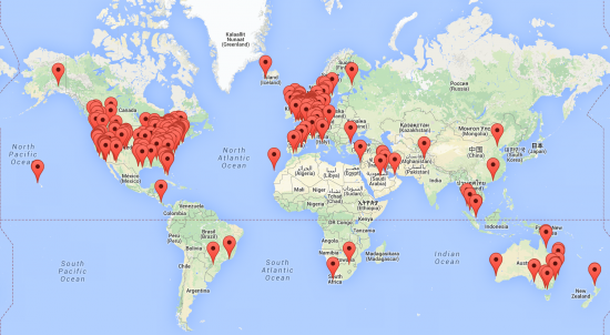
While doing our website reviews, we look at sites from all over the world. Most of our clients are from the United States and Europe, but we also have clients from Australia, South Africa and even China. Websites from different countries can differ largely in their choices for color, pictures, navigation and site structure. That made me wonder: are these differences due to cultural preferences? See all the Cultural Differences in Websites.
Why could cultural differences be of any importance?
As the web is growing and web shops are aiming at an international market, cultural differences and preferences in web design become of importance. Is a web page designed in one country equally appealing to potential customers in other countries? Are these international customers more likely to buy your stuff, if the design of your shop resembles the style of websites in their home country?
It could well be that the Yoast.com design appeals to a western audience, who perceive our avatars as funny or creative, while in China or Japan is our design is considered as childish and unappealing. In that case, we could alter our design in order to do big business in the far east…
Results from our own research
Almost two years ago, we did some research comparing websites from United States with websites from the Netherlands. We executed this research to inspire us to design our own themes. We decided to limit our focus (for reasons I will leave undiscussed here) on websites of dentists in both the United States and the Netherlands [JB emphasis].
The most prominent result of our research was the use of pictures. In the United States, it was common for a website to have a so-called ‘smile gallery’ with a number of pictures displaying beautiful white teeth from satisfied customers. In the Netherlands (bleaching of teeth is not common at all, in fact we all have brown teeth here) such galleries do not exist. This cultural difference is only applicable to dentist websites, although one could imagine that this kind of cultural differences could appear in other branches as well.
Our research also shows differences in actual design and navigational elements. In table 1 we show the presence of some content and navigational elements in dentist websites. We display percentages of sites in which an element was present. We compare between sites of dentists from the USA and sites of dentists from the Netherlands.
Table 1: differences in content and navigational elements in dentist websites (USA versus NL)USANetherlandsTestimonials50,025,7Social Media41,525,7FAQ32,135,0Opening hours67,979,9Search function13,224,8Footer Bar65,148,1Headings79,279,5Slide show25,517,6Movie15,16,5Number of websites106433
Results from our research show that American sites display testimonials more often and use social media on their website in more cases. In Dutch sites opening hours are shown more often and the search function of the website is present in more cases. American sites more often have slide shows and movies on their website. Headings are used equally in both countries, but a Footer Bar is often absent in Dutch website. These differences in websites could well be due to differences between dentist and dental insurance between the US and the Netherlands.
Color is subjective, of course. But judging from all websites we have analyzed, it’s safe to say that blue and blueish green, combined with a white background, are commonly used for both [.]
American and Dutch websites. The main difference lies in the mood set on the website. Where Dutch websites have a more business-like approach, American websites focus more on location or pictures of happy, smiling people.
From a scientific perspective
A quick search in some scientific search engines (Google Scholar, Picarta) soon gave me a pretty good idea of the scientific view on this subject. Many studies try to explain cultural preferences in web design, content and navigation with the model of Hofstede (e.g. Callahan, 2006). In Hofstede’s model of Culture five dimensions are distinguished, the world cultures vary along these five dimensions (all very interesting, but a bit out of scope for this post, though). Studies using Hofstede’s model for instance show that in more individualistic countries (US, Australia) websites show more pictures of individuals, while in collective societies (e.g. China) more images of groups are shown. Websites from the United States also appear much more personalized compared to websites from Korea or China (Zhao, Massey, Murphy and Fang, 2003). Studies also suggest differences in the preferences of navigational buttons (with or without text) and site structure (Lo Gong, 2005). Up until now, I haven’t found any study in which cultural differences are linked convincingly to differences in shopping behaviour.
And that remains the real question: does a culturally different design actually lead to less conversion? Does my website convert better in China if I put more pictures of groups on my website? You would certainly think that it will increase your sales. But where is the scientific proof? If anyone of you knows whether such a study has been executed, be sure to let me know!
What am I to do with this information?
If you are focussing on a local market: make sure your website appeals to a local public. That would be enough. Merely living in your local market would already give you enough expertise to investigate whether your website is in fact appealing to your audience. If you are unsure: ask your audience!
If you are aiming at an international public, as we do at Yoast, it could be wise to consider some revisions to your website in order to make it more appealing to an international market. The results of our own research and the scientific literature imply the existence of cultural differences between websites. It thus could be profitable to translate your content to different languages and offer different pictures of navigational options according to culture. Translating our plugins pages to Japanese and altering our avatars to Manga-style could perhaps be a great next step for Yoast (and a nice challenge for Erwin ;-).
But before you go and learn Chinese, I will investigate this topic a bit further and hope to tell you more about the influence of culture on conversion and sales in a few weeks.
Source: https://visualmodo.com/

1 comment:
I still like using yoast to double-check. I like it more because it's a text editor that helps optimize for Google that has wordpress integration.
Post a Comment